The CCPM Fever Chart: The Only Graph That Tells You Where Your Project Really Stands
The CCPM fever chart turns project progress into an immediate decision signal. Learn how to read it, interpret each zone, and use it to manage your portfolio.
The problem with every classic project dashboard
How many times have you heard "the project is 60% complete" — without knowing whether that was good or bad news?
A progress percentage alone says nothing. It does not tell you whether the project burned through all its margin to reach that 60%. It does not tell you whether the end date is at risk. It does not tell you where to focus attention.
The CCPM fever chart solves precisely this problem. By combining two pieces of information — progress and buffer consumption — it turns a vague number into a clear decision signal. It is the central indicator of the CCPM method, and one of the few project management graphs that actually says something actionable.
What is a fever chart? Definition and principle
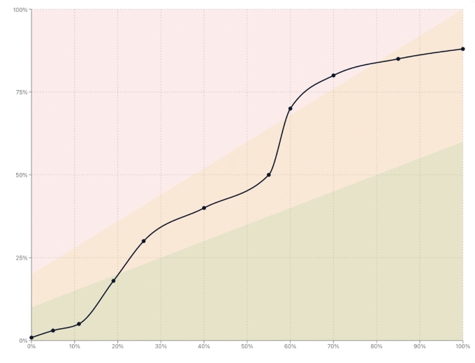
The fever chart is a progress tracking tool specific to Critical Chain Project Management.
Its principle is simple: two axes, one point, one decision.
- Horizontal axis (X): the project's percentage of completion, from 0% to 100%.
- Vertical axis (Y): the percentage of buffer consumed, from 0% to 100%.
Each project is represented by a point on this graph. The position of that point within one of three coloured zones immediately signals whether the project is healthy, needs monitoring, or requires intervention.
Why 'fever'?
The name comes from a medical analogy: just as a thermometer shows whether a patient has a fever, the chart shows whether the project is "running hot" — consuming its time reserve faster than it is advancing.
The three zones of the CCPM fever chart
The chart is divided into three zones, typically represented by a green-to-red colour range. These zones are not arbitrary: they reflect the relationship between the rate of progress and the rate of buffer consumption.
| Zone | Signal | Interpretation |
|---|---|---|
| Green | Healthy | The project advances faster than it consumes its margin. No urgent action needed. |
| Amber | Watch | The buffer is being consumed faster than progress is being made. Analysis is needed. |
| Red | Act now | The project is at risk. The remaining margin is no longer enough to absorb further drift at this rate. |
Zone boundaries are set at project creation, typically using proportional thresholds relative to the total buffer. A project that consumes 30% of its buffer to reach 30% progress stays in the green zone — it is "advancing with its margin." A project at 30% progress that has already consumed 60% of its buffer is in the red zone.
What the green zone does not guarantee
A project in the green zone is not a risk-free project. It can remain there until late in execution, then shift quickly if a critical resource is pulled elsewhere. Regular monitoring remains essential.
How to read a fever chart: step by step
On a single project
To read the fever chart for a single project:
- 1
Locate the project point on the graph. Its horizontal position shows where progress stands (e.g. 45%).
- 2
Read the vertical position: what share of the buffer has been consumed (e.g. 30%)?
- 3
Identify the zone: is the point in green, amber, or red? That is your immediate signal.
- 4
Observe the trajectory if you have the history: is the point rising quickly toward red, or holding steady in green? The trend matters as much as the position.
A project at 45% progress with 30% buffer consumed is in good health: it still has margin and is progressing correctly. The same project with 70% buffer consumed is in the red zone — it has spent nearly all of its reserve without reaching the halfway point.
On a portfolio of projects
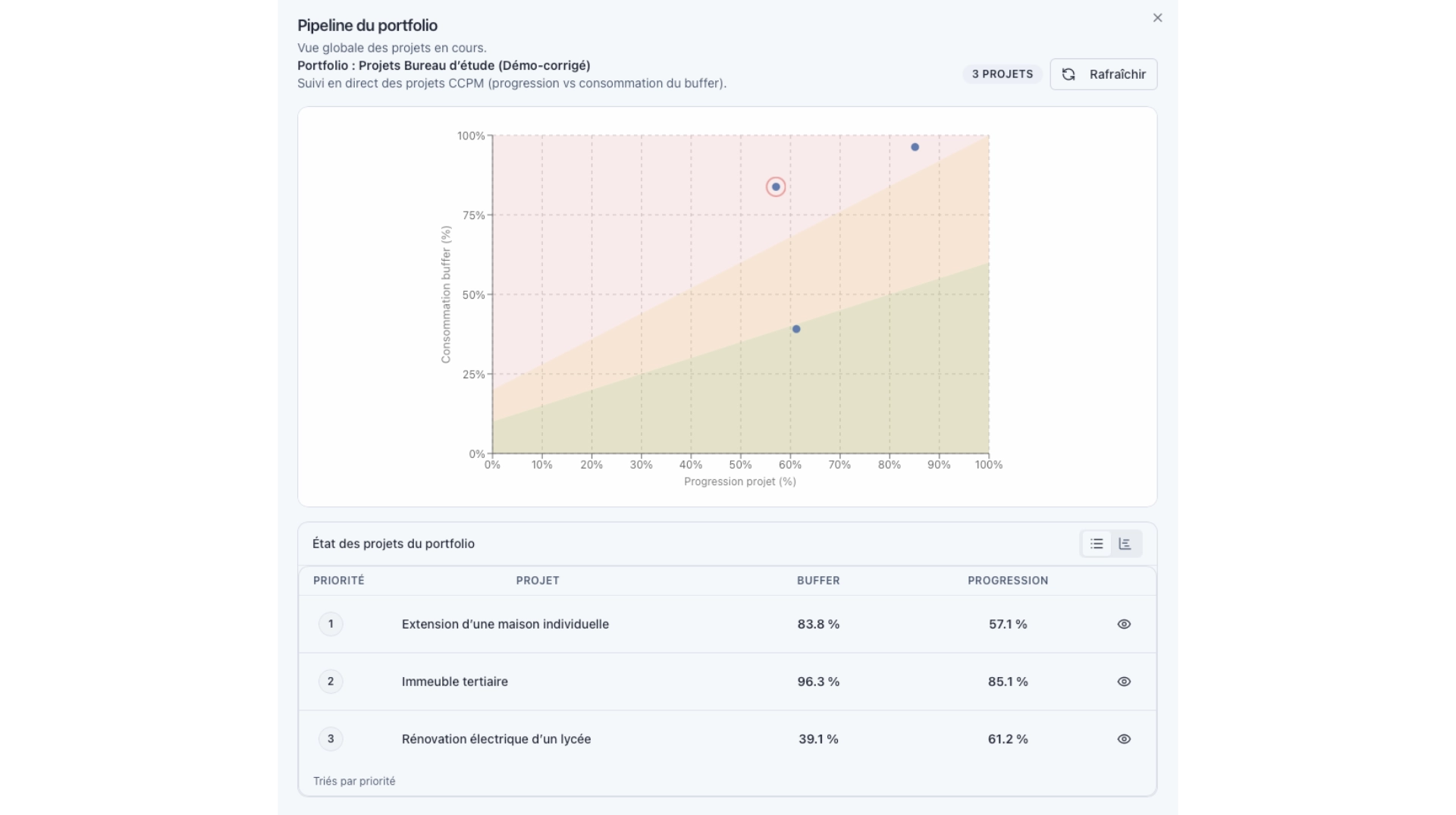
The portfolio fever chart is the multi-project version of the same tool. Each point represents one project. The reading shifts slightly:
- In the red zone: these projects require priority intervention. Start with them.
- In the amber zone: these projects deserve analysis. Identify the cause of the drift before it worsens.
- In the green zone: these projects are healthy. Regular monitoring is sufficient.
This view is particularly powerful for decision-makers managing multiple simultaneous projects: it replaces dozens of individual status updates with a single visual reading.
The real value of the portfolio fever chart
In a steering meeting, it allows you to know in 30 seconds which projects should drive the conversation — without going through a detailed report project by project.
CCPM fever chart: what other indicators miss
The fever chart is often compared to other tracking indicators. Here is what sets it apart.
| Indicator | What it shows | What it misses |
|---|---|---|
| % progress alone | Project advancement | Whether margin was consumed to get there |
| Gantt chart | Schedule and dependencies | Overall project health at a glance |
| Classic RAG (Red / Amber / Green) | A subjective status | An objective measure based on two variables |
| CCPM fever chart | Progress AND buffer consumption | — |
What the fever chart provides is an objective, continuous measure of project health. It does not depend on a subjective assessment of "things are fine" or "things are bad." It depends on two numbers: how far the project has come, and how much margin it consumed to get there.
Common reading mistakes
Confusing green zone with absence of problems
A project can be in the green zone because its buffer was oversized — not because it is actually healthy. Conversely, a project can enter the red zone quickly not due to poor management, but because its buffer was set too short. The quality of the initial buffer estimate determines how reliable the reading will be.
Ignoring the trajectory
The instantaneous position of the point is less informative than its movement over time. A project that has been climbing steadily toward red for several weeks is more concerning than one that just entered the amber zone after a one-off disruption.
Only reacting to red
Intervening in the amber zone is often more effective than waiting for red. In amber, the project still has enough margin to absorb a correction. In red, the options are more limited and the decisions more costly.
Fever chart and decision-driven management in KairoProject
KairoProject calculates and displays the fever chart automatically, at both the individual project and portfolio levels. Every time the remaining work on a task is updated, the consumed buffer is recalculated and the point moves on the graph.
This is not just a visual dashboard. It is a decision-driven management system: it orients priority trade-offs, signals which resources need protecting, and helps decide which project deserves immediate attention in a loaded portfolio.
The full method — buffers, critical chain, constrained resource — is detailed on KairoProject's Method page.
Frequently asked questions
Start with the core principle: if your project's point is in the bottom-right area of the graph (high progress, low buffer consumption), the project is in good shape. If it is in the top-left (little progress, high buffer consumption), the project is at risk. The coloured zones formalise these intuitive readings.
Not meaningfully. The fever chart is inseparable from the CCPM buffer concept. Without an identified and tracked project buffer, the two axes of the graph lose their meaning. That is why it is specific to the CCPM method and tools that implement it.
The frequency depends on the pace of the project. For short projects (a few weeks), a weekly review is usually sufficient. For longer projects or those with heavily constrained resources, twice-weekly monitoring may be warranted. Consistency is what matters most: the trajectory of the point over time is as informative as its current position.
No — they answer different questions. The Gantt shows the project's structure and sequence: which tasks, in what order, with what dependencies. The fever chart shows the project's overall health: is the end date still achievable? Both are complementary in rigorous project management.
Read next
Your schedule may be perfectly correct — and your project will still be late
Critical chain and critical path look similar but drive very different project realities. Understanding the difference changes how you manage projects for good.
How to Prioritize Multiple Projects with Shared Resources
When an engineering firm runs several projects with the same team, project-by-project prioritization breaks down. A clear method to make decisions based on real signals.
Why Your Gantt Chart Becomes Unreliable the Moment Your Projects Share the Same Resources
Gantt charts work well for isolated projects. They become misleading the moment multiple projects compete for the same people. Here is why, and what to look at instead.